Finance Dashboard UI/UX
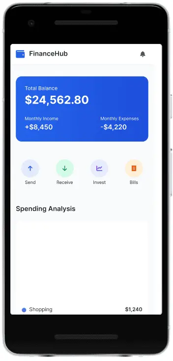
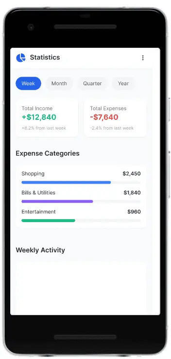
A comprehensive financial management platform designed as a personal project to simplify complex data visualisation and analysis through intuitive UI/UX design.
Project Brief
The Finance Dashboard is a personal design project focused on simplifying complex financial data through elegant, intuitive UI/UX. The aim was to build a responsive and accessible dashboard that delivers insights through clean data visualiations and thoughtful user flows.
The Challenge
Financial dashboards often overwhelm users with cluttered data and unclear hierarchy. My goal was to create a platform that balanced functionality with visual clarity, enabling everyday users to interact with their finances confidently and make quick, informed decisions.
Design Process 🛠️
Research & Discovery
Conducted user and competitor research to uncover pain points in existing financial tools, focusing on data overload and navigation issues.
Prototyping & System
Designed low and high-fidelity wireframes, then developed a clean design system with responsive components for seamless cross-device use.
Key Design Outcomes ✨
Enhanced Data Clarity
Created clear, visually compelling charts and graphs for quick, easy interpretation of complex financial data.
Streamlined User Experience
Intuitive layout and logical navigation flow reduced friction for first-time users, promoting confident financial tracking.
Responsive & Adaptable Design
Seamless usability across devices, ensuring the user experience is consistent from mobile to desktop screens.


